Wednesday, September 28, 2011

Love Is In The Details

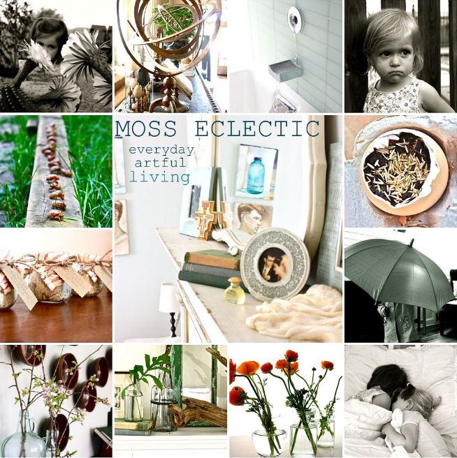
Home can be a tiresome entity if you let it. It's easy to focus on the imperfections and become overwhelmed by the thought of what you still need to make it complete. However, when I take them time to think it through I notice it's the simple and imperfect things in my own home that make me the happiest...
 favorite notes and sentiments
 terracotta and fresh flowers
 family treasures in Saf's room
collections of scents and old books
 handmade pillows
 maps and painted doors
 art supplies

 tarnished silver heirlooms filled with seasonal things
 natural textures and contrasts
old shiny things

everyday life in black and white

too many pictures to share. old and new. here it goes.....


Monday, September 26, 2011

my famous sister


you can tell how busy life over here is by the fact that I completely forgot that Nicole, my lovely and very talented sister, was making a little television debut. with Nate. Berkus. 

Her home is sort of our afternoon hobby. Hers, but I say "our" because most afternoons I like to come over for tea and talk her into say, repainting her living room, rearranging furniture, or somesuch whim. Her husband loves me :)

She won't let me post pictures of its current state, but you can see it in its previous life in the pictures that I took for the Nate Show, here.

AND If you haven't checked out her blog you should. I honestly don't know how she comes up with things. I especially like her "Monday Matches" where she links an interior with a piece of art.
Por ejemplo:
William Waldron via I Hate To Alarm You
"Maria La Guapa" by Joaquin Sorolla y Bastida via I Hate To Alarm You


Brilliant!

Thursday, September 22, 2011

client sneak peek

Despite the gray day and the total lack of time for styling (and the fact that I had all 3 of my design helpers with me...all under 4 feet tall), yesterday I popped in to drop something off at a client home and snapped a picture to share of one of the bedrooms. I couldn't resist. Thanks to the ever fabulous Paul and Nancy of Paul David design, the window treatments are up, and they do so much to lend the room a more finished feeling.

You might remember some of the inspiration for the room....posted six months ago. It's the room of two teenage girls, 15 and 16. Bold was the look we were after...possibly giving their poor father a few heart attacks along the way. I mixed in some earthy elements for good measure (and because I can't do a room without at least a touch of natural).


This is what is looked like BEFORE:

And AFTER:

Once we finish up with the artwork (and I'm not trying to take a picture while juggling a baby in my arms:), I'll post a few more.

Wednesday, September 14, 2011

Moss & Co. is happy to announce

that it is no longer boasting a gaping whole in its bathroom.....
it only took 6 months to amend this situation...
which, I suppose,  is what happens when you're spending all your free moments working on other people's homes. I've been in crunch mode for last several months (but at moments it feels more like 100 years).

Here's a peek into the progress of one of the homes...

ok, wait for it. This pic deserves a little background story. This is a painting of the family in a previous home, one with soaring ceilings and beautiful architectural details. They wanted to recreate the feel in their new home, but there was a little problem... the new home looked like this...
Not so similar, you see. We relocated the built-ins to a different part of the house and went to work.
 
With three sets of sliding glass doors leading out to a covered porch, there was little wall space for their things, and unlike most families today, they didn't like the idea of the current open floor plan. Their number one request was that the kitchen be closed off. BUT doing so meant that instead of walking into the kitchen/dining/living room, visitors walked straight into the kitchen.

To avoid the awkwardness of this set up, and to create more room for their beautiful collections, we closed off one set of sliding doors, and converted one third of the long screened-in porch into an all weather entry and breakfast room...

(for now, just ignore the tiny rug. The room is still being tweaked, and this was a rug they already owned). It flows so nicely into the living room (they call it the "drawing room"--so sweet!):
before:
during:
 "after" (still tweaking):

It's more formal and traditional than the styles I normally work in which is why I've hesitated to show any pictures, but I'm pleased with the progress so far.

more soon!
Thursday, September 8, 2011

Ochre and Canvas homes

The rainy weather we've been experiencing this week makes me think of some of my favorite interiors, both homes of Andrew Corrie and Harriet Maxwell, owners of Canvas & Ochre (two of my all time favorite shops). I love the muted colors and natural textures. Their city apartment is sort of clean and moody both at once, you can just picture watching the rain splash outside the window...


And I think their Shelter Island home is just as delightful in a more laid back kind of way. This bedroom kills me with its simplicity and relaxed textures...


These days its so common to see limed and washed wood finishes everywhere you look, and sometimes they can look so drab collectively, but there is something about Ochre and Canvas' aesthetic that is always interesting and tactile even with such a subdued palette.


Images: 1,3, 4, Ditte Isager, 2, 5, 6,  elle decor, 7, 8, 9, 10 Ditte Isager for house beautiful
Related Posts Plugin for WordPress, Blogger...